Partna

Partna

Project Description

Partna is an all-in-one payments stack built to help global businesses launch and operate in Africa. The project brief centered around a significant brand transition. Partna was shifting from a B2C product to a B2B company, with a core offering 

built around a payments API handling
both on-ramp and off-ramp transactions.

The design challenge was to support that transition visually while making
a technically complex product feel clear and credible to a business audience. I led the full visual redesign, covering brand identity, illustration system, and marketing design across social and print.

Partna is an all-in-one payments stack built to help global businesses launch and operate in Africa.
The project brief centred around a significant brand transition. Partna was shifting from a B2C product to a B2B company, with a core offering built around a payments API handling both
onramp and offramp transactions.

The design challenge was to support that transition visually while making a technically complex product feel clear and credible to a business audience. I led the full visual redesign, covering brand identity, illustration system, and marketing design across social and print.

Partna is an all-in-one payments stack built to help global businesses launch and operate in Africa.
The project brief centred around a significant brand transition. Partna was shifting from a B2C product to a B2B company, 

with a core offering built around a payments API handling both onramp and offramp transactions. 


The design challenge was to support that transition visually while making a technically complex product feel clear and credible
to a business audience. I led the full visual redesign, covering brand identity, illustration system, and marketing design across social and print.

Partna is an all-in-one payments stack built to help global businesses launch and operate in Africa.
The project brief centered around a significant brand transition. Partna was shifting from a B2C product to a B2B company,

with a core offering built around a payments API handling both
onramp and offramp transactions.


The design challenge was to support that transition visually
while making a technically complex product feel clear and credible
to a business audience. I led the full visual redesign, covering brand identity, illustration system, and marketing design across social and print.

Scope

Brand design

Illustration

Art direction

Credits

Art direction and Illustration-

Rukhayat Orekoya

Art direction and Illustration-

Rukhayat Orekoya

Art direction and Illustration-

Rukhayat Orekoya

Branding- Anthony Ameji, Rukhayat Orekoya

Branding- Anthony Ameji, Rukhayat Orekoya

Branding- Anthony Ameji, Rukhayat Orekoya

Global Currencies

The Logo

The mark was built around the concept of a coin in motion.
A single coin rotating into a stack, then abstracted into the final symbol. The idea was to visually encode the core product: money moving, multiplying, and settling across borders.

Product Offerings

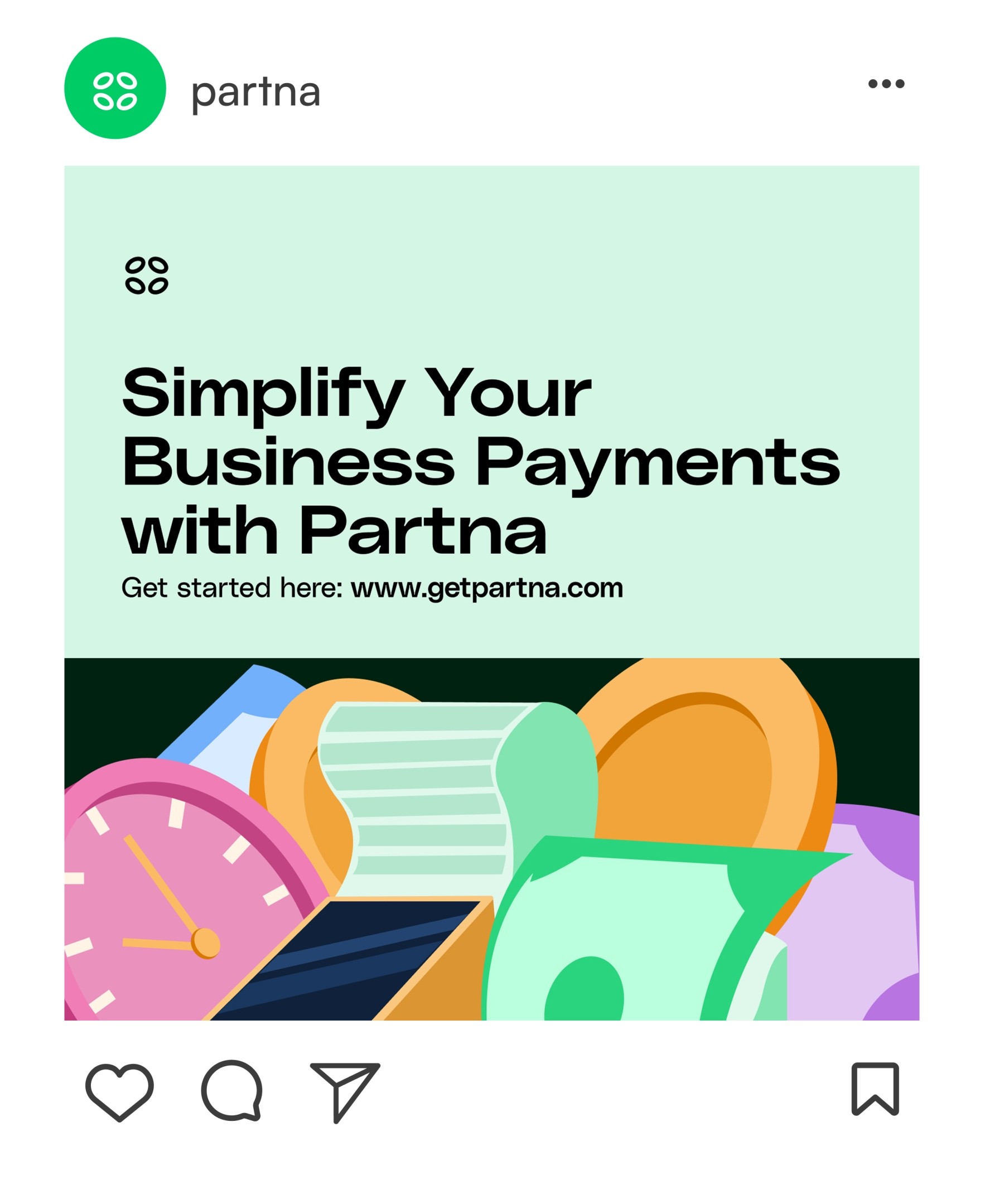
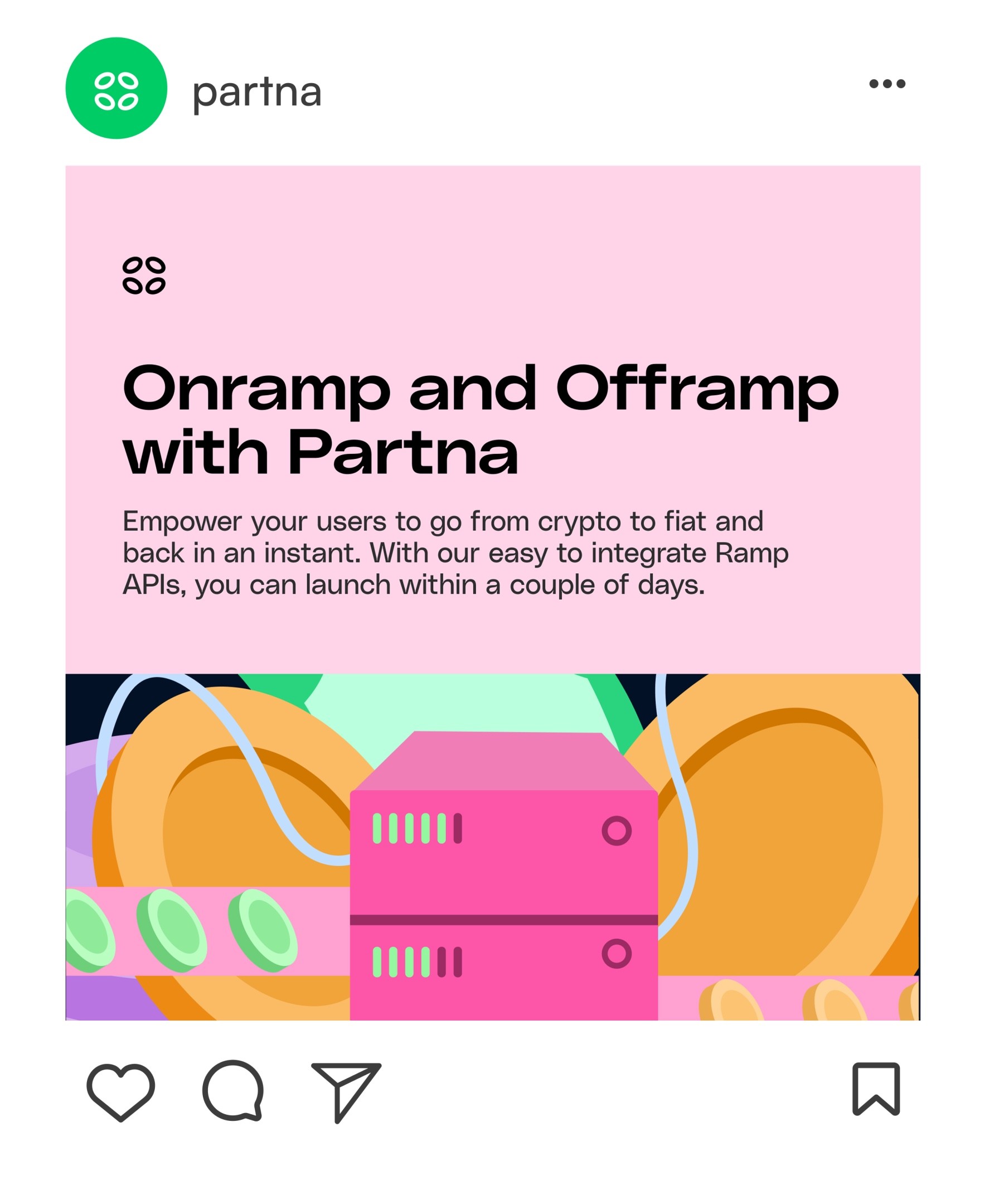
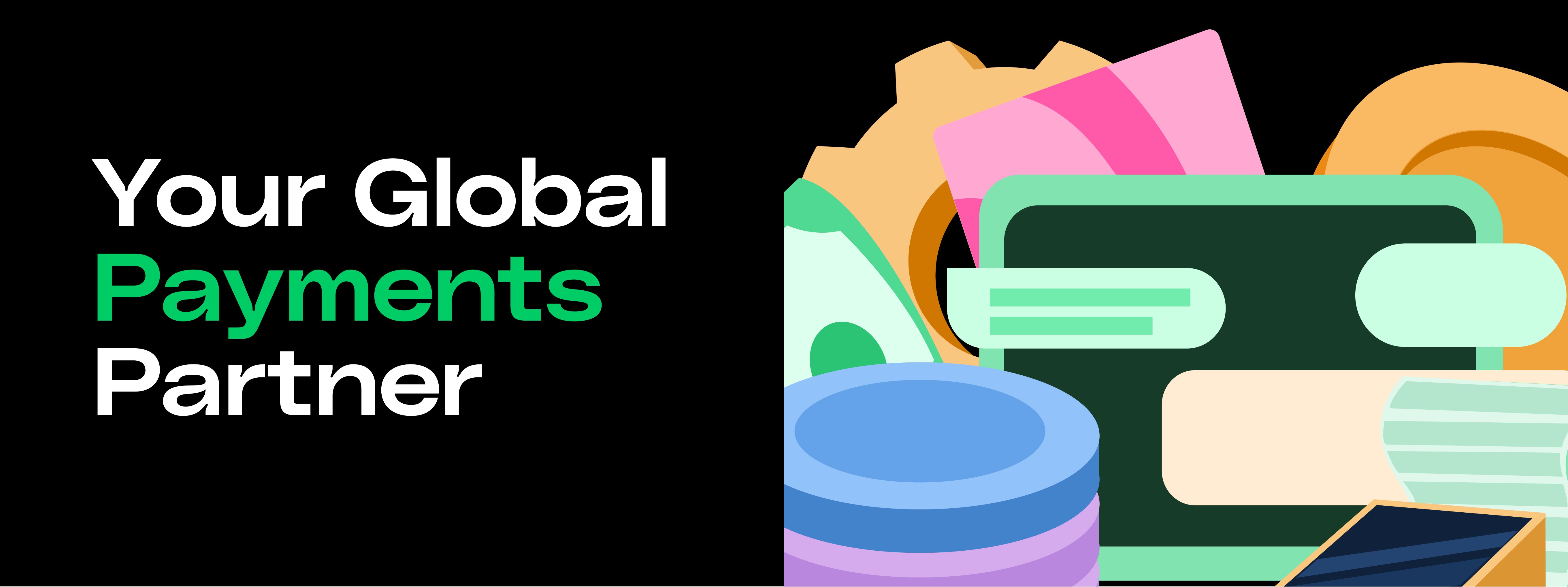
The illustration style was a deliberate departure from the stiff, monotone aesthetic common in fintech. Using rounded forms, overlapping objects, and a rich colour palette, the system was built to feel approachable and distinct.

24-7 Customer service

Developer Documentation

Onramp and Offramp with Partna

All in one payment stack

Onramp and Offramp system

Across all currency

Conceptually, the style was informed by the nature of cross-border payments — integration, flow, transformation — with each illustration designed to communicate a specific product offering.

For the more technical product offerings, the approach was to distil complex API concepts into their most essential visual form, using illustration to provide clarity without oversimplification.

Conceptually, the style was informed by the nature of cross-border payments — integration, flow, transformation — with each illustration designed to communicate a specific product offering. For the more technical product offerings, the approach was to distil complex API concepts into their most essential visual form, using illustration to provide clarity without oversimplification.

Social Media

The color palette for this branding was chosen to deliberately distance the brand from the cold, corporate aesthetic dominant in fintech.
Warm, saturated hues of pink, purple, blue, and light tones give the brand an energetic quality, balanced by a deep green that grounds the system. Green anchors the palette as the primary color, adding credibility without sacrificing warmth.

Blog Covers

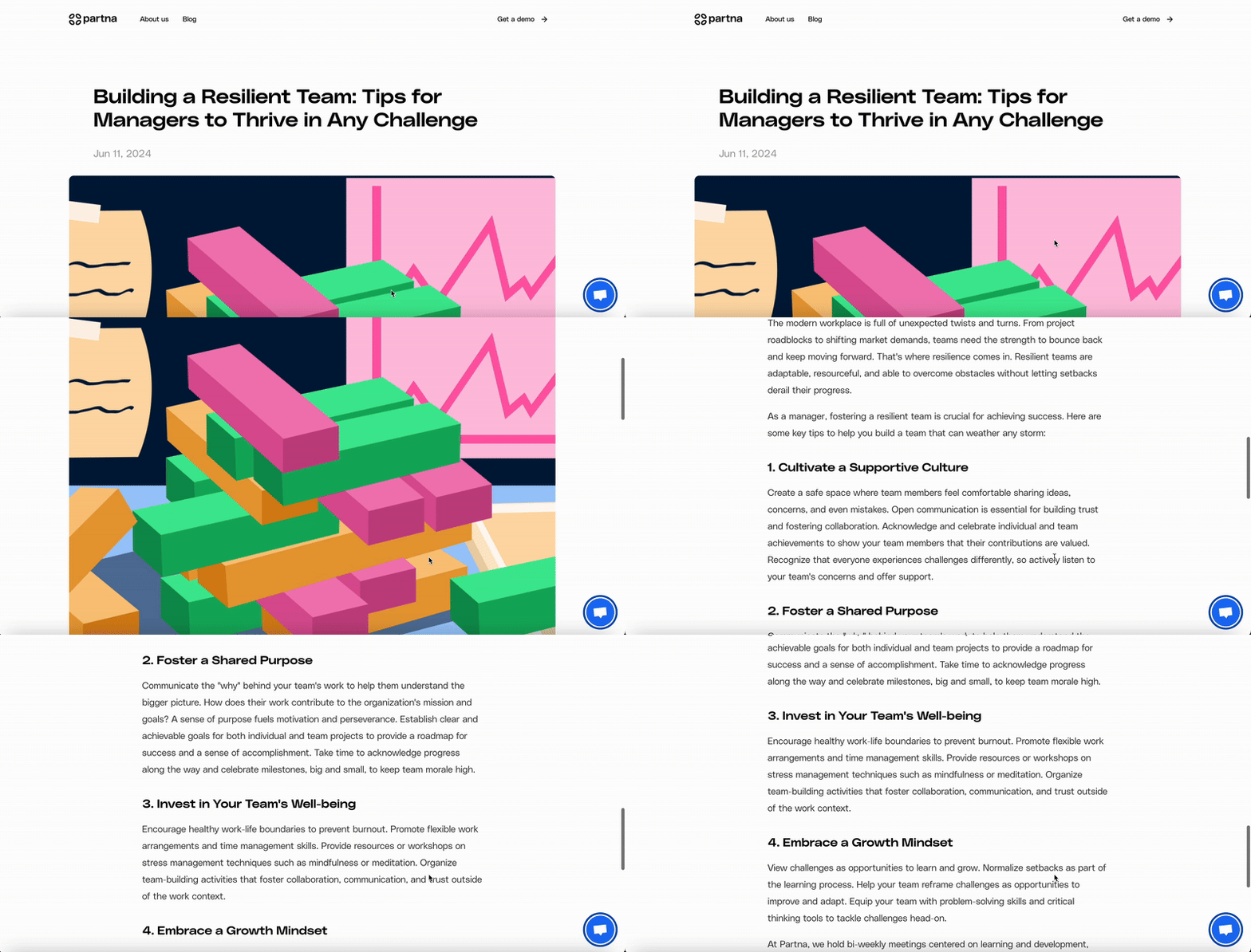
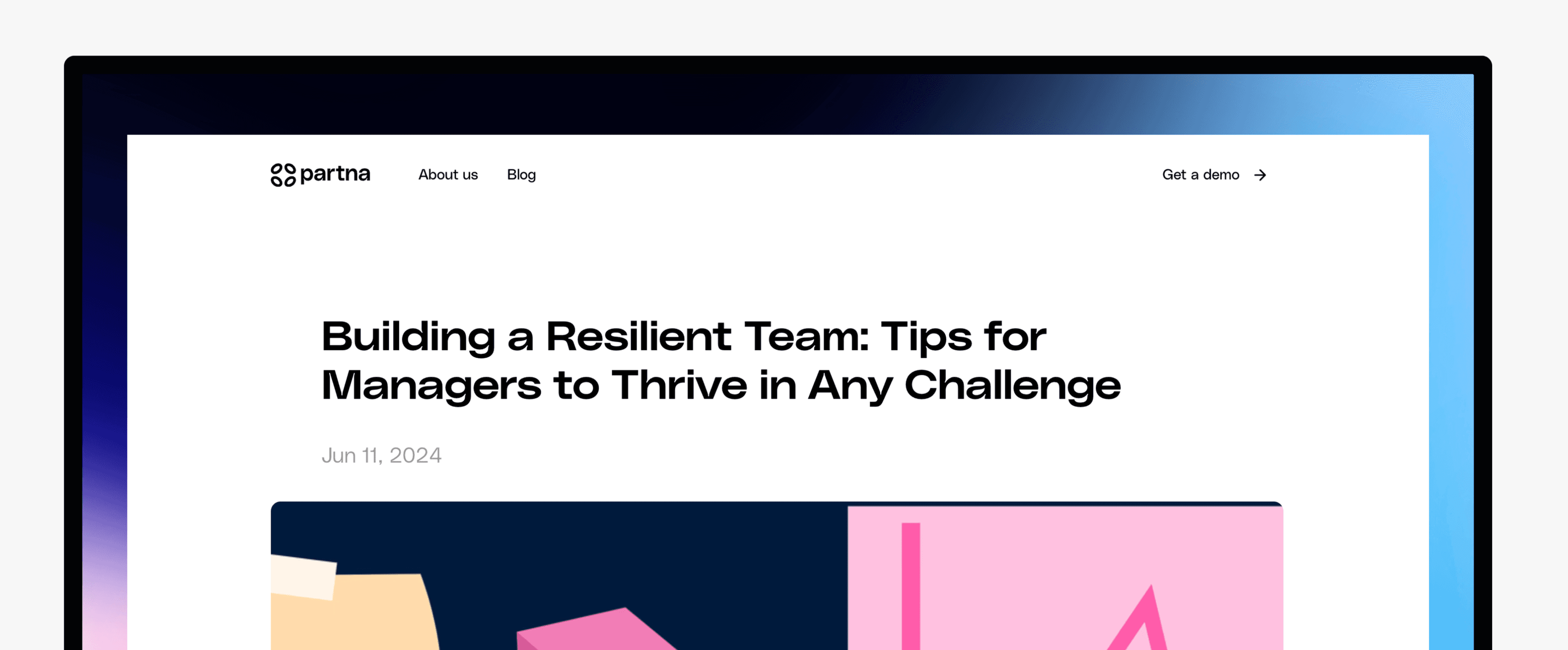
Building a Resilient Team

Building blocks and Market strategy

Authentication vs. Authorization:
Other Projects
Other Projects
Other Projects

Rukhayat Orekoya

Brand Designer, Illustrator

Rukhayat Orekoya

Brand Designer, Illustrator

Create a free website with Framer, the website builder loved by startups, designers and agencies.